If you purchase through them, we may earn a small commission at no extra cost to you.
See our Disclaimer for full details.
You probably don’t know that most bar lighting erases pale inks and skinny fonts, so a cute script can vanish by midnight. You want tees that pop in photos, feel soft, and don’t shrink after one wash. Think sharp slogans, bold type, high‑contrast colors, and clear roles—Bride, MOH, crew. Pick crop or oversized, test a sample, and choose the right print method. Next up: what to say, what to wear, and where to order fast.
Key Takeaways
- Pick an on-theme slogan with location puns or inside jokes, add role labels (Bride, MOH), and keep messages short for clear photos.
- Use bold sans-serif typography with roomy spacing; prioritize high-contrast inks and readability at ten feet under patio or bar lighting.
- Choose photo-friendly palettes: black/white anchors with neon accents, or skin-tone flattering hues; test in daylight and dim rooms.
- Coordinate fits and roles: matching base color, varied cuts, subtle icon tweaks, and a date/city stamp for timeless keepsake tees.
- Order from Custom Ink, Printful, VistaPrint, or local screen printers; sample-wash once, confirm sizes XXS–4X, then bulk screen print for durability.
On-Theme Slogans and Wordplay
Picking a slogan that actually fits your theme does the heavy lifting, because the right words make the shirts feel like part of the plan, not an afterthought. Start by naming the weekend’s heartbeat, like “Desert Disco” in Scottsdale or “Salt and Vows” in Miami, let your lines chase that story. Location Puns work fast, so think “Nash Bash,” “Austin We Do,” or a cheeky “Wine Country, Fine Bride,” and don’t be afraid to tailor it to streets you’ll walk. Fold in Inside Jokes only your crew gets, like the bride’s love of midnight pancakes or her habit of singing the wrong lyrics, and keep it kind, not snarky. Test the phrase out loud while you pack, and picture it on the group at brunch, on the boat, and in airports. If it still clicks, it’ll photograph clean, spark grins, and feel like a souvenir with a spine.
Minimalist Fonts Vs Bold Typography
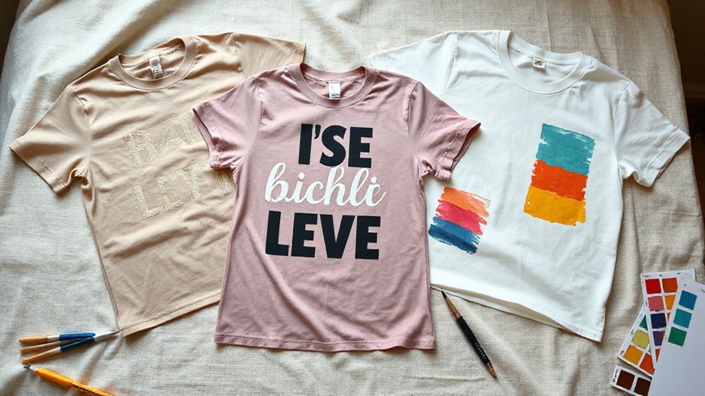
You’re choosing between clean lines that feel sleek and grown-up and bold type that hits hard, like a thin sans serif for “Bride Crew” versus big block letters that shout “LAST FLING.” Think about readability at a glance, because your friends should catch the words from across a noisy bar and in a fast photo, so short phrases and clear letters beat curly scripts that smudge into a blob. Match ink to shirt color with simple rules you can trust—white pops on navy, black stays crisp on blush or pastels, and chunky bold letters hold up on bright tees while skinny fonts get lost, which I’ve learned the hard way under patio lights at midnight.
Clean Lines Vs Impact
How do you choose between clean, quiet lines and big, shout-it-from-the-rooftop letters for your bachelorette tees? Start by picturing the night: rooftop spritzes or dive bar jukebox, slow glow or loud sparkle. If the vibe is sleek, lean on clean lines, plenty of Negative space, and small marks that feel intentional, like a thin sans, a tiny crown, a date tucked low near the hem. If you want impact, punch it up with Bold silhouettes, thick strokes, and a centered chest hit that lands like a high-five. Try one twist: pair a spare script on the front with a bold back name stack, so the set tells a story. Test on a sample tee, step back, and trust your gut. Trust the quiet echo.
Readability at a Glance
When the night moves fast, your tees need to talk quick, so think about what folks can read from ten feet away in a noisy bar or under string lights on a windy deck. At that Viewing Distance, skinny scripts blur, while sturdy sans faces hold shape. Minimalist fonts with clean strokes and roomy letterspacing read fast, especially in small lines like Bride Squad, but keep them thick enough to survive shaky Lighting Conditions. Bold typography punches through clutter, great for one big word, like BRIDE, yet can turn clumsy if you cram a sentence. Test both: print at size, tape it to a wall, step back, and squint. If you can catch the message in one heartbeat, you’ve nailed it, partner. Tonight too.
Contrast on Shirt Colors
Now that the words read clean across the room, the next fight is color contrast between the ink and the shirt. You pick tones that pop without yelling, because Contrast psychology says our eyes chase edges like magpies. On black tees, crisp white or neon brights carry, while pale gray fades by midnight. On blush or sand, deep navy beats pure black, which can look dusty. Minimalist fonts like thin sans need higher Perception thresholds, so give them bolder color gaps. Big, bold typography buys wiggle room, but don’t get lazy.
- Test swatches outdoors and under bar lights; phones lie.
- Aim 70/30 light-to-dark difference; think cream on cocoa, not fog on steel.
- Print one sample; wash twice; keep what still hits.
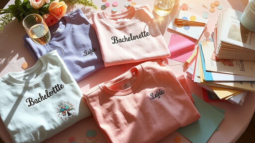
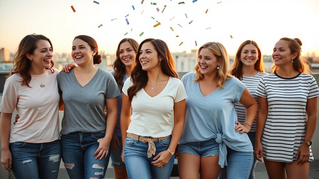
Color Palettes That Pop in Photos
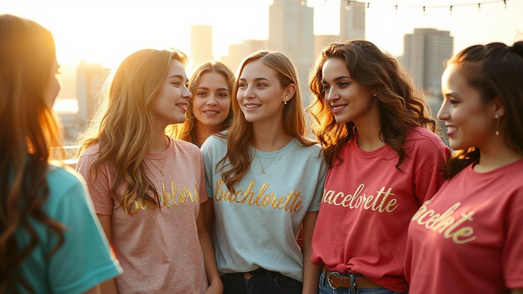
You want colors that punch through in photos, so pair high-contrast neutrals and neon, like black tees with hot pink, white with neon lime, or charcoal with electric blue, because they stay sharp in daylight and don’t fade into mush under bar lights. Then make sure the palette flatters skin, mixing coordinated shades so everyone looks good, like soft blush for fair skin, warm terracotta for golden tones, cool lavender for olive, and rich emerald for deep complexions. Test before you commit, hold the shirts to your face in the sun and in a dim room, snap quick selfies, and pick the combo that stays clear and kind on camera, because the lens is honest, sometimes a little too honest.
High-Contrast Neutrals and Neon
Because high-contrast neutrals make neon sing, this combo turns simple tees into photo magnets without much fuss. You anchor the design with black, charcoal, or crisp white, then drop in hot pink, lime, or volt yellow so the letters jump like street signs, which helps with safety visibility when the night gets lively. There’s a retro influence too, like old arcade lights, so the look feels bold and nostalgic without trying too hard.
- Go black tees with neon mint names across the chest, add a tiny neon heart on the sleeve; photos look sharp.
- Pick white tees, print a neon gradient for the bride’s title, use charcoal for the rest.
- Use charcoal tees with volt yellow numbers for a rally vibe, easy to spot.
Skin-Tone Flattering Palettes
After all that neon buzz, the next win is picking colors that make every face glow in real life and in photos, the kind where nobody’s asking for a retake. You do a quick undertone mapping, nothing scary, just look at wrist veins and favorite lipstick, then group the crew by cool, warm, or neutral, and let seasonal harmonies steer the picks. Cool girls pop in cobalt, berry, and icy pink; warm tones sing in coral, sunflower, and soft olive; neutrals handle dusty rose and teal like champs. Put the bold color on the tee and keep the neckline trim light, so faces stay bright. Skip ash gray near the chin. Test swatches by window light, snap pics, pick the keepers for the bride.
Bride-Centric Graphics and Icons
A ring, a veil, and a little crown do a lot of heavy lifting when you want the bride front and center on a bachelorette tee, and they read fast from across a bar.
Keep the icons bold, simple, and clever, so folks clock “bride” without squinting, and the print shop nails it on the first pass. Think about symbol evolution, too; a chunky retro ring feels playful, while a minimal line-art veil leans modern, and both carry the story. If you borrow pop shapes, check licensing considerations before you click order, because cease-and-desist isn’t a party favor. Add small anchors that age well—date, city, maybe a tiny heart—so the tee becomes a souvenir, not just a gag.
Bold, clever icons scream bride; retro ring or modern veil. Check licensing, then add timeless anchors—date, city, tiny heart—for keepsake tees.
- Pair the crown with the bride’s initials inside tiny stars.
- Draw the veil as motion lines trailing her name.
- Stack ring, date, and city like a stamp.
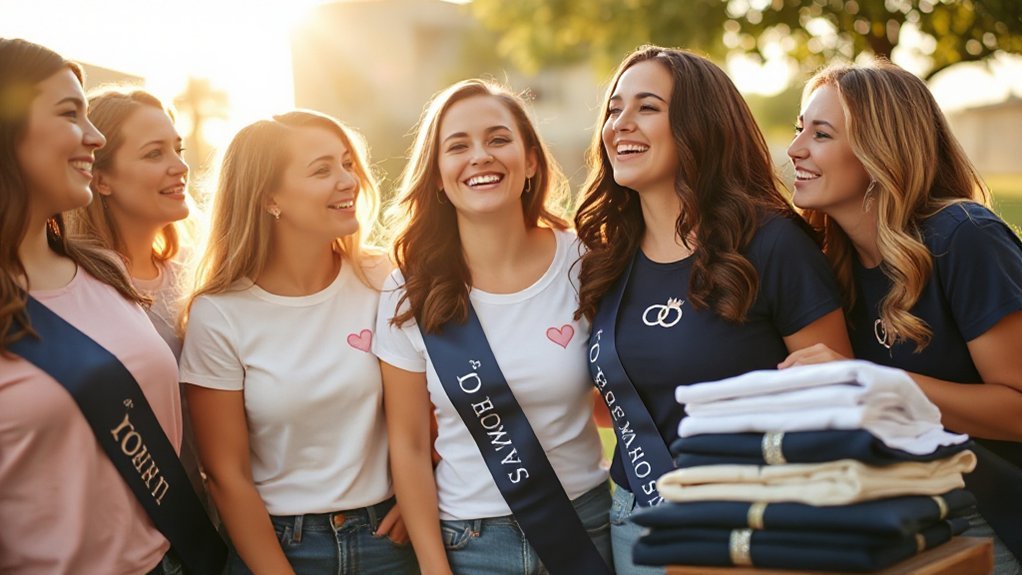
Matching Sets, Mix-and-Match, and Roles
You pick a coordinated color palette so everyone looks like a team in photos, think soft blush for the bride, dusty sage for the maid of honor, and deep black or denim blue for the rest so nobody fades. Then you mix and match role‑specific tee designs that say Bride, Maid of Honor, Bridesmaid, and maybe Bestie Wrangler for the friend who herds Ubers and tabs, because clear labels stop the who’s‑who scramble at the bar. Keep the same font and print style so it all ties together, let folks choose crop or classic or oversized fits that feel good, and you’ll get clean group shots and calm smiles without fuss.
Coordinated Color Palettes
How do you pick colors that make the bride shine and the crew feel like a team? Start with seasonal palettes and quick moodboard creation, pull photos from the venue, the city lights, or the beach chairs, and you’ll spot the tones that already feel true. Aim for contrast that’s kind, not loud, so white pops, black steadies, and a bold accent ties the story.
- Matching sets: choose one anchor hue, then use two tints for depth; it looks tidy in pics and easy to pack.
- Mix-and-match: keep the same base, rotate accents like coral, sage, or lilac, and the group stays cohesive.
- Roles: vary shade intensity only, so leadership reads without shouting, more like a little wink than a billboard.
Role-Specific Tee Designs
With the palette settled, turn those colors into tee designs that spell out who’s who without shouting. Go matching for the core team—Bride in bold script, MOH in a punchy block, bridesmaids in the same font with tiny icon tweaks, like rings, stars, or little guitars if the night skews rowdy. Mix-and-match the rest so friends, cousins, and work pals can pick cuts that fit, crop, crew, or oversized, while staying inside the color lane. Print Role Etiquette on a sleeve—one quick line like “Hype, hydrate, haul rides,” so jobs are clear without bossing. Add Perk Listings on the back hem, three bullets for fun, “First drink, photo veto, late checkout.” It reads playful, and it actually helps. Fewer questions, more dancing, easy packing.
Fabric, Fit, and Size-Inclusive Tips
Picking the right fabric and fit matters more than the glittery slogan, because a bachelorette tee has to survive a long day, a late night, and a group photo you’ll frame. Go for soft cotton or stretch blends that bounce back, breathe, and don’t chafe, and you’ll thank yourself at midnight. Look for tagless comfort and shoulder taping so seams don’t rub when you dance or haul gift bags. Aim for midweight fabric, not flimsy, not stiff, the kind that drapes without clinging.
Make sizing easy and kind:
- Offer full size runs XXS–4X, with tall and petite options; mix unisex, fitted, and relaxed cuts so folks pick what feels right.
- Sample one tee in two sizes for the bride, wash and dry it hot, note shrink, lock sizing.
- Build a try-on plan: collect bust, waist, hip and preferred ease in inches, pack quick backups, swap day-of without fuss.
Printing Methods: Screen, DTG, DTF, and Vinyl
Before you order a pile of shirts, decide how you’ll get the ink on the cotton, because the print method decides the look, the feel, the price, and whether that design survives the after-party wash. For big groups and bold art, screen printing is the old workhorse, thick ink, bright color, great ink durability when it hits curing temperatures around 320°F, and it laughs at spilled mimosas. DTG prints straight on the fabric, loves 100% cotton, keeps tiny details and photo shadings, and feels soft, but it needs pretreat and gentle washing or it can fade faster. DTF lays ink on a film first, then heat-presses it to the tee, so it sticks to many fabrics, pops with color, and stretches well, though the feel can be slightly rubbery. Vinyl shines for names, metallics, and quick tweaks; it’s crisp and tough, but heavier, and fine lines get fussy.
Where to Order: Quick-Turn Online Printers
Once you’ve settled on the print method, the next hurdle is finding a shop that can hit your date without fuss. Quick-turn online printers are built for speed, and they’ll tell you ship dates front, which saves your nerves and group chat. Look for clear lead times, real-time design previews, and Order tracking that doesn’t feel like a black box. If they offer Rush pricing, make sure it buys you earlier production, not just faster shipping.
Pick quick-turn printers with clear calendars, real-time proofs, transparent tracking, and rush that accelerates production.
- Check the clock: pick a printer that shows a production calendar, cutoffs by noon, and weekend runs when you’re down to the wire.
- Vet the blanks: choose soft ringspun tees, size runs in stock, and color counts that match your plan, so no cousin gets left in the cold.
- Test the workflow: upload art, approve a proof, place one sample, then scale the order—smooth clicks now save headaches later.
Where to Order: Etsy Makers and Small Shops
Why go with an Etsy maker or a small shop? You get a real person shaping your tees, not just a faceless system, and that means nimble tweaks, clever fabric picks, and small-batch care that shows when the box lands. Seller communication is the secret sauce here; you can DM a maker, ask about a softer ring-spun cotton, metallic ink, or a cropped cut, and they’ll usually reply with straight answers and options.
I’ve messaged a seller at night, and she sent a quick photo of ink swatches on sage shirts, plus a note about sizing that saved us from baggy sleeves, small thing, big win. Expect handmade packaging with tissue, twine, maybe a tiny thank-you card, which turns hand-out time into a moment, not a chore. Look for shops with clear timelines, photos, and reviews that mention consistency, because charm is great, but follow-through is the keeper.
Where to Order: Local Print Shops and Proofing
If you like that hands-on feel from Etsy makers, a walk into your neighborhood print shop gives you the same real-person care with less guesswork and no shipping roulette. You can touch tees, check ink swatches, and talk timelines face to face, which keeps the bridal herd moving and your budget honest. Ask for a printed sample or a color-calibrated proof, because screens lie and dance floors are bright.
- Bring clean files on a drive and email, fonts outlined, PMS colors listed, and sizes locked. Tell them your party date, not just the ship date.
- Nail Proof Turnaround. Push for a same-day hard proof or a 24-hour window, sign off with initials, and do a quick test wash on one shirt.
- Plan Pickup Logistics. Get boxes labeled by size, count twice, leave a one-day buffer, and make sure the car fits all tees and hangers.