If you purchase through them, we may earn a small commission at no extra cost to you.
See our Disclaimer for full details.
When you’re sending her off to the next chapter, your signs do the heavy lifting without shouting. Think a neon “Last Fling” over the bar, a wood welcome at the door, and arrows for backyard games. Pick bold fonts you can read on a phone, lay down vinyl with a Cricut or a paint pen, and plan mounts. Here’s what to grab, what to skip, and the quiet gotcha most hosts miss.
Key Takeaways
- Pick a theme—Neon Nights, Cottagecore, or photo backdrop—use cheeky copy like “Vow and Wow,” and place signs at entrance, bar queue, and photo wall.
- Choose materials: acrylic, rustic wood, acrylic mirror, or chalkboard; finish and maintain properly for smudge-free shine and safe, reusable pieces.
- Design for legibility: 1-inch letters read at 10 feet, center around 58 inches, tilt to reduce glare, pair sturdy sans with playful script.
- DIY options: Canva/Figma printables, Cricut vinyl cuts, or hand-lettered paint pens on acrylic/wood; mock up, test in hallway light, adjust spacing.
- Ordering custom? Vet vendors, request natural-light proofs and swatches, confirm size/material/palette/date, clarify wood grain or tint shifts, and plan shipping buffers.
Theme-Driven Sign Ideas: From Neon Nights to Cottagecore
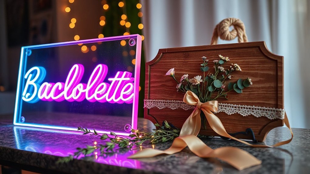
How do you pick signs that actually match the vibe you’re building, not just look cute in a cart? Start at the door, because Entrance Ambiance sets the tone before anyone grabs a drink. For Neon Nights, cue bold words, punchy arrows, and playful rules like “Dance Floor This Way,” placed where feet naturally bottleneck, so flow feels easy. Keep copy short and cheeky, since the room’s already loud. For Cottagecore, lean into gentle phrasing, floral motifs, and map-like wayfinding—“Garden Sips,” “Slice the Pie,” “Guest Book Nook”—so folks move slow and hang around. Make Photo Backdrops do double duty: one big welcome line that also frames hugs, plus smaller callouts near the bar and games to spark little moments you’ll want to keep. Test placement by walking the path yourself, phone in hand like a guest, and fix any spot that feels fussy. Simple words, clear arrows, smiles.
Materials & Finishes: Acrylic, Wood, Mirror, Chalkboard, and More
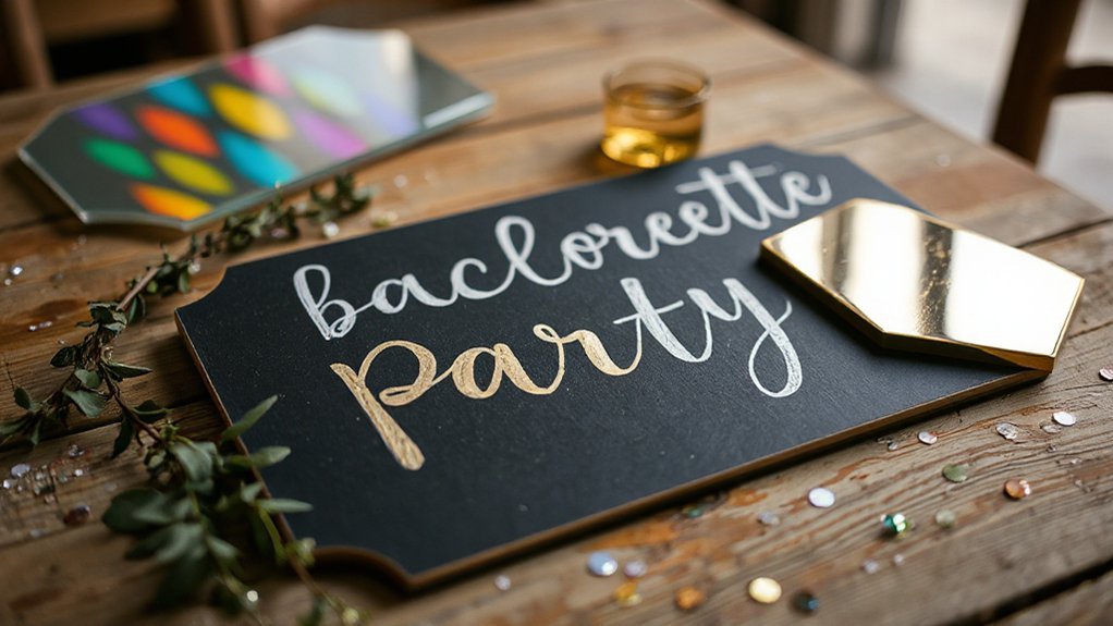
You pick your sign like you pick your boots for the night—go acrylic when you want that sleek shine that wipes clean after a spilled spritz, or grab wood when you’re after a rustic texture that looks good with twine and a little scuff. If you want glam that snaps in photos, choose a mirror finish so guests see themselves while reading “Bride’s Last Rodeo,” and yes, fingerprints happen, but a soft cloth in your pocket fixes that. For quick menu swaps or goofy scores, chalkboard still pulls weight, just start with a smooth board and a bold chalk marker so the letters don’t dust off mid-toast.
Sleek Acrylic Shine
A clear acrylic panel catches light like a lake at noon, giving your bachelorette signs that crisp, modern shine that says party without yelling. You print white ink on the back, or lay vinyl lettering on the front, and the words float, neat and clean, like they’re riding on air. Set it near candles or a neon rope and you’ll get lighting interplay that shifts through the night, which makes setup simple and photos pop. Wipe smudges with a microfiber cloth, no fuss, and use clear standoffs so it seems to hover. For photographic highlights, angle the panel a touch, away from glare, and let one edge kiss a light. Add a slim base, pack it flat, and reuse it. Trip-proof and budget-friendly, friend.
Rustic Wood Texture
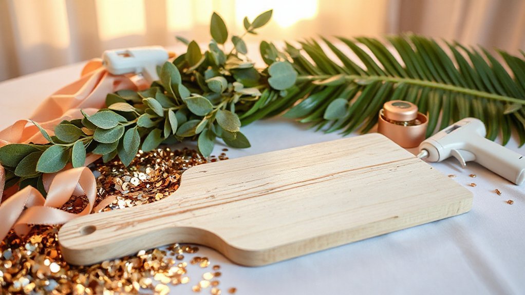
When you lean into rustic wood, the sign brings that porch-swing calm and a little grit, like it’s seen a few good parties already. You pick a board with honest knots and a few scrapes, then sand the splinters smooth so guests feel that tactile warmth, not a snag. Torch the edges for a kiss of shadow, or rub coffee into the grain for a soft, lived tone that winks at aroma nostalgia. Stencil bold letters, or screw on cut letters, and add a tiny shelf for flowers or favors, useful beats fussy every time. Hang it with jute and brass screws, seal with matte poly, and you’ve got a tough, pretty marker that photographs clean and packs up easy for the next stop.
Mirror Glam Finish
Though “mirror glam” sounds high-fuss, it’s really about clean shine and smart choices so the thing survives the night and the photos. You pick acrylic mirror over glass, because it looks luxe yet weighs little, and it won’t shatter if someone bumps it, and you back it with foam or felt so it lands soft on tabletops. Use vinyl lettering or paint pen, test a corner, and wipe with microfiber, not paper towels that scratch. Add standoff mounts or a slim easel, round the corners, and hide an LED strip along the edge for that halo pop. Run quick safety precautions: no sharp edges, no wobble, no glare at eye level. Then follow an inspection checklist—fingerprints, chips, loose hardware, clean reflections. Ready, set, sparkle.
Sizing, Layout, and Placement for Maximum Impact

Get the size and layout right, and your sign does the heavy lifting before anyone even sips a mimosa. Start with Sign Hierarchy, which just means big message first, helpers second. The bride’s name or “Last Fling” headline gets the largest type, then directions like “Bar this way,” then the small bits. Think about Audience Sightlines: people stand about six to eight feet away, often holding a drink, so don’t make them squint. A good rule, one inch letter height reads at ten feet; measure your room and back into it.
Place the sign where feet naturally stop: entry, bar queue, photo wall. Hang the center around 58 inches, tilt slightly to kill glare. Leave clean margins so words can breathe. If folks move fast, use tall, narrow layouts; for lounges, go wide and calm. At tight rentals, stack two signs—welcome at door, actions by the bar inside. Test from the far chair; if you can read it, you’re golden.
Fonts, Color Palettes, and Visual Style Guides
You pick fonts like you pick boots—go on-brand with one sturdy workhorse for legibility and one with a little flair for headers, so a bold sans with a playful script says “party” without yelling, and it still matches the invite and the bride’s vibe. Colors set the mood fast, so blush and gold feel soft and celebratory, black and white read chic, emerald feels confident, and neon pink says bring the energy, which is great for the bar sign but maybe not the toast note. Jot a tiny style guide—two fonts with sizes, three hex codes with roles, and a rule like “script only for titles”—and every sign from the welcome board to the bathroom mirror will look like it came from the same smart set, not a frantic 11 p.m. print run.
On-Brand Font Pairings
While the bride’s vibe sets the tone, your signs stay on-brand when your fonts, colors, and little rules all match and repeat, like a good chorus you can’t miss. Pair a bold display script for the bride’s name with a clean sans for details, and keep weights consistent so nothing fights. Check license considerations before you snag that trendy type; budgets hate surprise fees. Meet accessibility standards: aim for large sizes, open counters, and clear 1–2 level hierarchy so tipsy eyes still read the schedule. Set a style rule: headers in the same font every sign, body copy in one partner font, and numbers in a mono or tabular set. Print a mockup, hang it in hallway light, and see sticks and squints better.
Palette Psychology Basics
Because colors and letters carry moods the way music carries a beat, your palette and fonts end up steering the whole party vibe before anyone reads a word.
Think color symbolism as signs, and use mood mapping to plan flow.
Pick two hero colors, one anchor, one accent, then match fonts.
Test them in daylight and phone light; you’ll see signs live in both.
- Neon pink with black, chunky sans and tidy mono; loud, legible, party-ready.
- Terracotta and dusty rose, relaxed serif plus open sans; warm, grounded, easygoing.
- Deep teal with white, geometric sans and lean script; modern, clean, clear.
Save your choices in a simple style guide, so vendors and helpers stay synced when prints and last tweaks hit tonight.
DIY Projects: Printables, Cricut Cuts, and Hand-Lettered Options

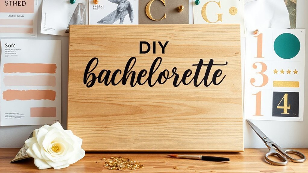
Starting with simple DIY signs sets the tone fast, stretches the budget, and keeps the bride’s vibe front and center. You can spin up printables in an hour: design right in Canva or Figma, export clean file formats like PNG for photos and PDF for crisp text, then print on heavy cardstock, trim, and back with foam board so it stands straight after cheers. For Cricut cuts, pick vinyl that matches your palette, mirror text for iron‑on, and use smart weeding tricks like peeling warm, lifting from the corner, and poking stubborn bits with a safety pin you already own. Slow your blade for tiny serifs, because fiddly cuts like to tear when you rush. If you love the human touch, hand‑letter on acrylic with an oil‑based paint pen, sketch guides with a dry‑erase marker, and wipe the marks after. It’s quick, personal, and tough enough for travel.
Custom Vendor Playbook: Working With Makers and Online Shops
Even if you love a good DIY, some signs sing louder when a pro makes them, so here’s how to work with vendors without blowing your timeline or your wallet.
Start with vendor vetting like you’d check a borrowed truck, thorough, peek at reviews, zoom photos, and ask for two recent client shots taken in light, not studio magic. Message them with your size, material, palette, and event date, then ask for a proof date and a ship date, because clocks matter.
- Ask what happens if wood grain varies or acrylic tints shift, and get it in writing, plus payment terms, deposit size, and refund rules.
- Request a material swatch or a laser test on scrap, it’s cheap insurance and saves you from surprise sparkle.
- Plan buffers, seven to ten days for shipping, two for fixes, and one extra for weather, because storms don’t RSVP.
Copy That Pops: Punny Phrases, Drink Menus, and Photo Booth Props
With your vendors squared away, now comes the fun part—the words that make people grin.
Start with Pun etiquette: go clever, not cruel, keep it bride-bright. “Vow and Wow,” “Last Fling Logistics,” or “Sip Happens” land soft and still sparkle. Build a tiny drink menu that reads like a playlist: Spicy “Ring of Fire” margs, bubbly “Yes, Spritz,” and a zero-proof “Cold Feet Cooler” so everyone’s in. Print it bold, big ice icons, no squinting in dim bars. For photo booth props, mix one sign that says “Team Yes,” one arrow for “Where’s the Cake,” and a chunky QR that links to your shared album. Your Hashtag strategy should be short, clean, and tested: #KayToBae, not #KaitlynAndJonathanForeverMaybe. Check it for duplicates and weird crossposts. Keep one master welcome sign, then sprinkle mini table tents so jokes echo. When in doubt, read it aloud; clunky lines show their elbows.